In our recent blog post about the XPRT results database, we promised to discuss the WebXPRT 4 results viewer in more detail. We developed the results viewer to serve as a feature-rich interactive tool that visitors to WebXPRT.com can use to browse the test results that we’ve published on our site, dig into the details of each result, and compare scores from multiple devices. The viewer currently has almost 700 test results, and we add new PT-curated entries each week.
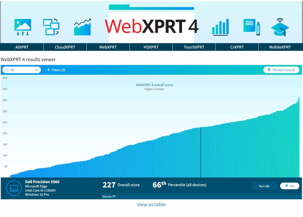
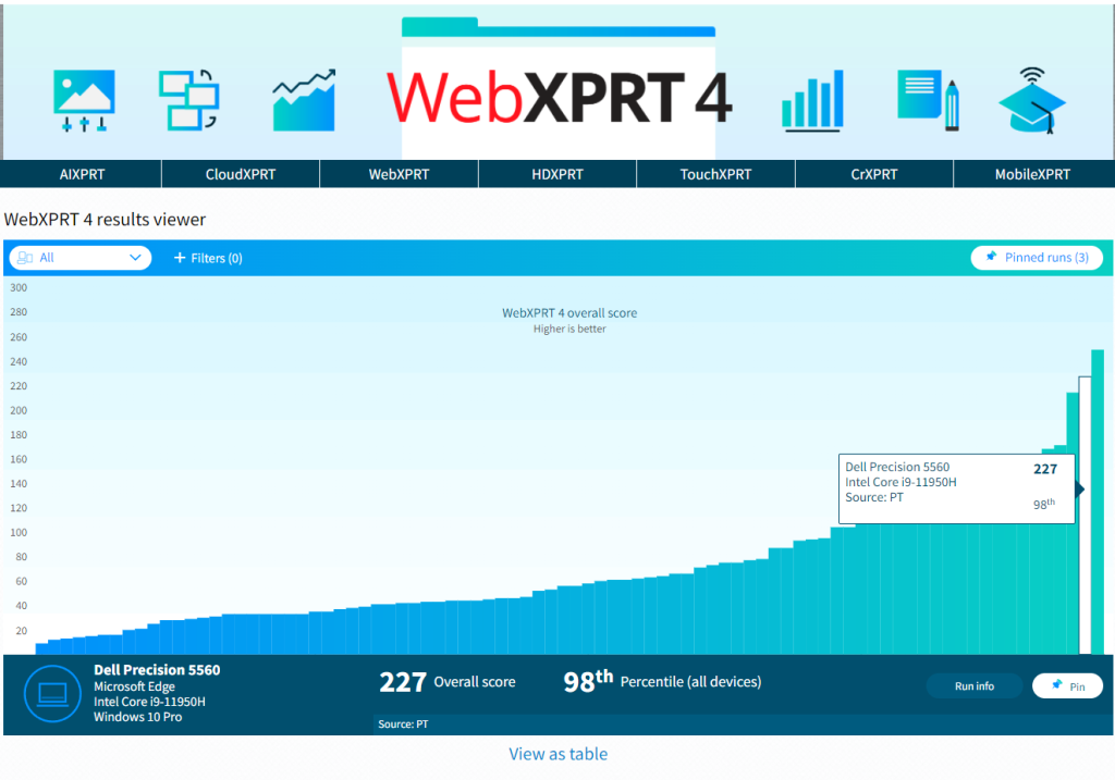
Figure 1 shows the tool’s default display. Each vertical bar in the graph represents the overall score of a single test result, with bars arranged left-to-right, from lowest to highest. To view a single result in detail, hover over a bar to highlight it, and a small popup window will display the basic details of the result. You can then click to select the highlighted bar. The bar will turn dark blue, and the dark blue banner at the bottom of the viewer will display additional details about that result.
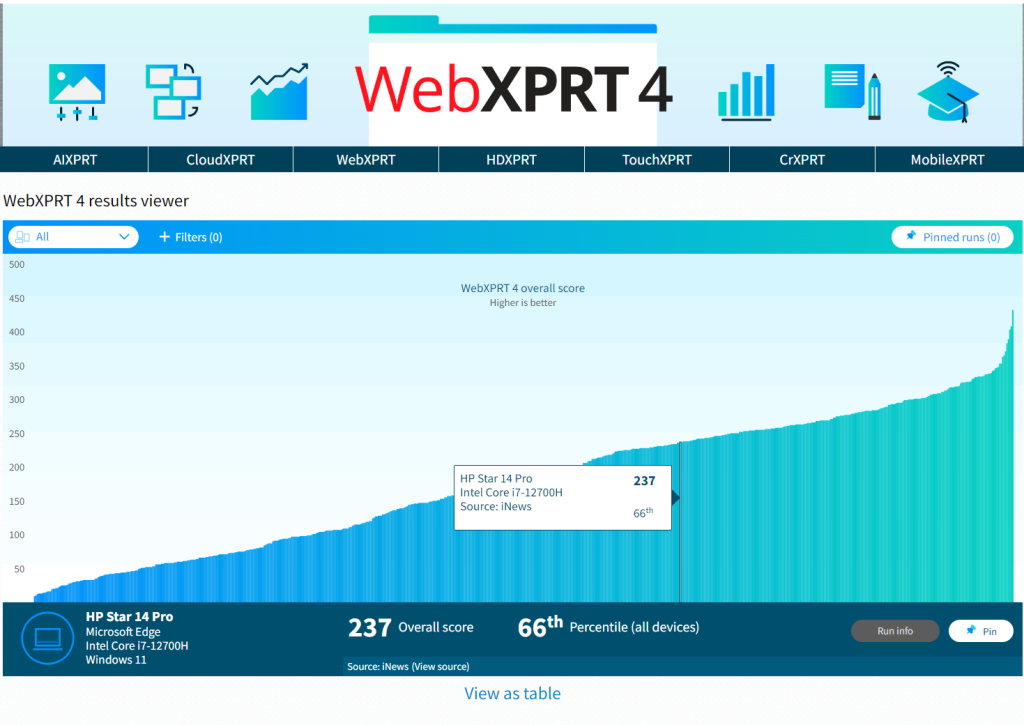
In the example in Figure 1, the banner shows the overall score (237), the score’s percentile rank (66th) among the scores in the current display, the name of the test device, and basic hardware configuration information. If the source of the result is PT, you can click the Run info button in the bottom right-hand corner of the display to see the run’s individual workload scores. If the source is an external publisher, users can click the Source link to navigate to the original site.
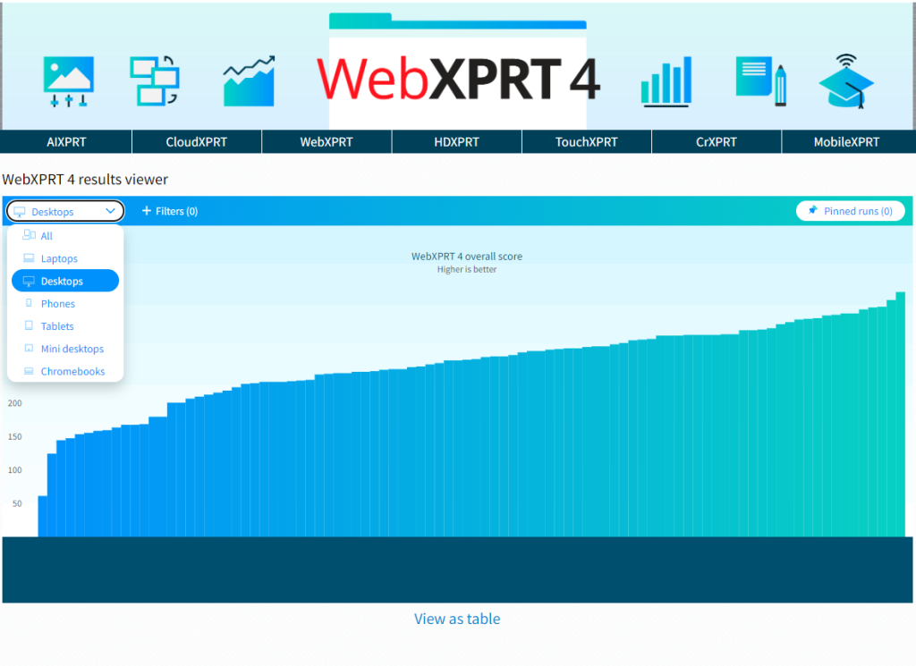
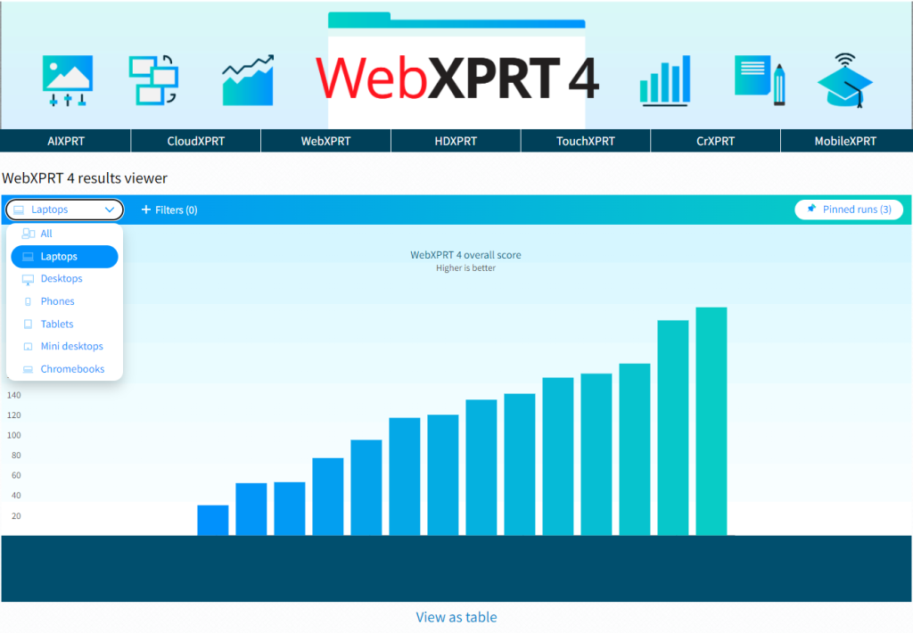
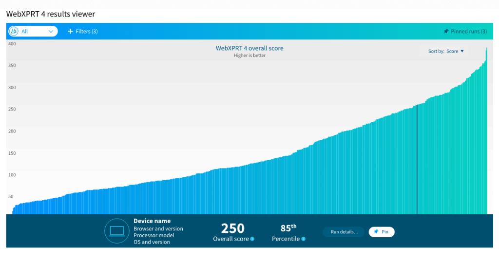
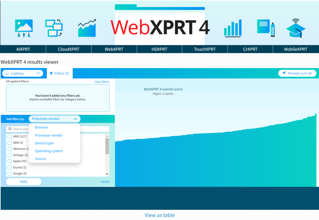
The viewer includes a drop-down menu that lets users quickly filter results by major device type categories, plus a tab with additional filtering options, such as browser type, processor vendor, and result source. Figure 2 shows the viewer after I used the device type drop-down filter to select only laptops.
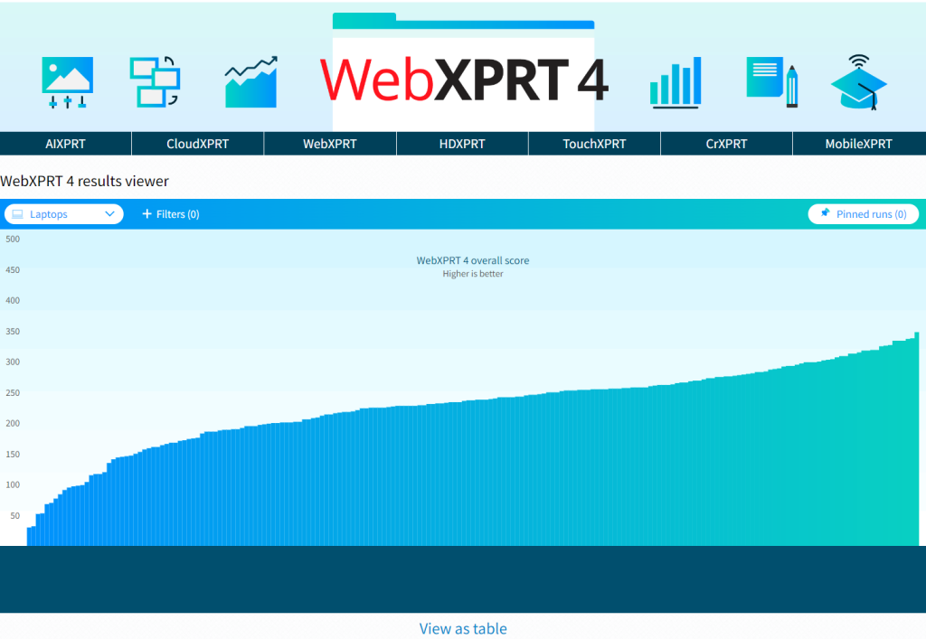
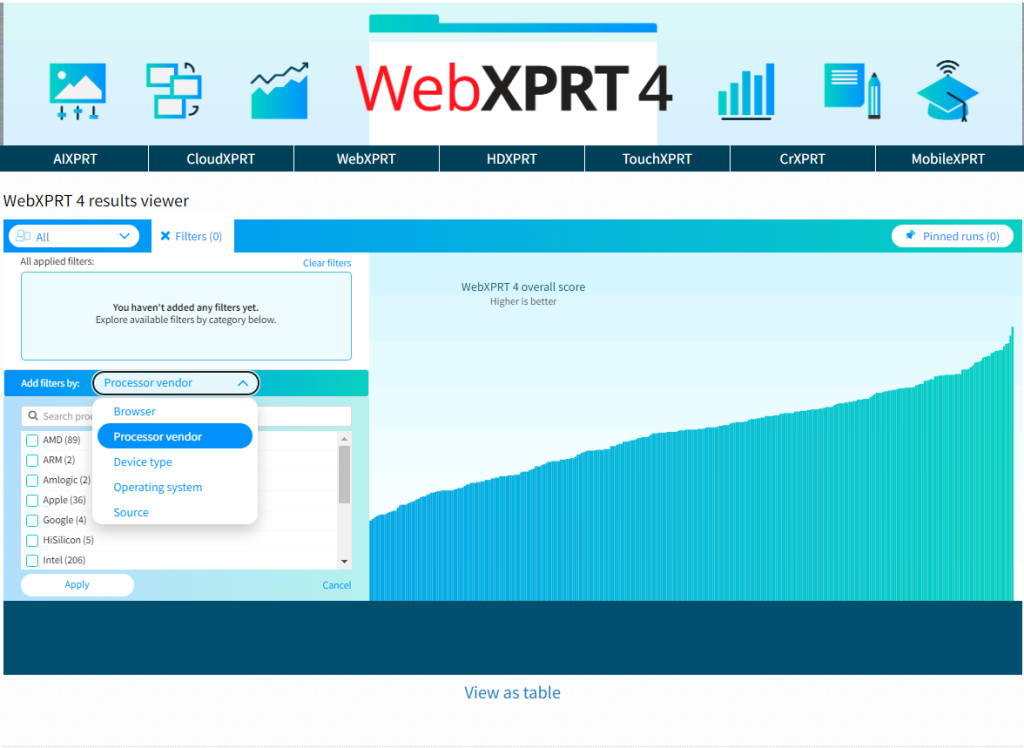
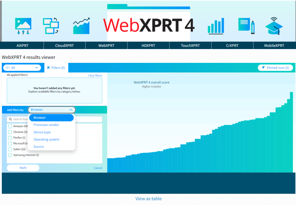
Figure 3 shows the viewer as I use the filter tab to explore additional filter options, such as processor vendor.
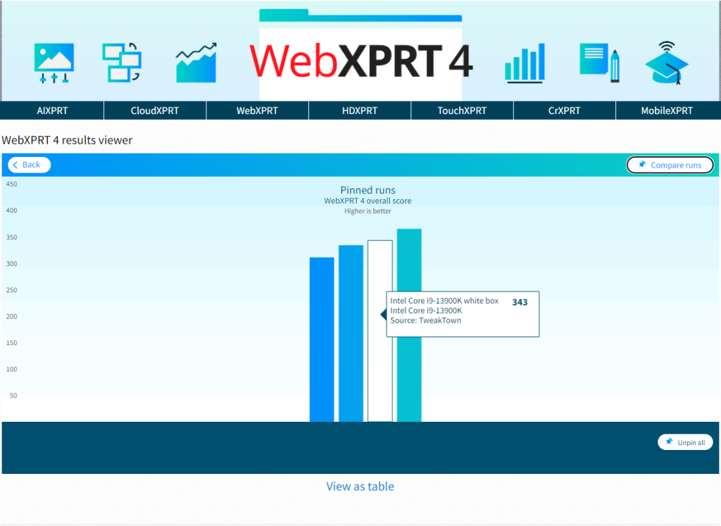
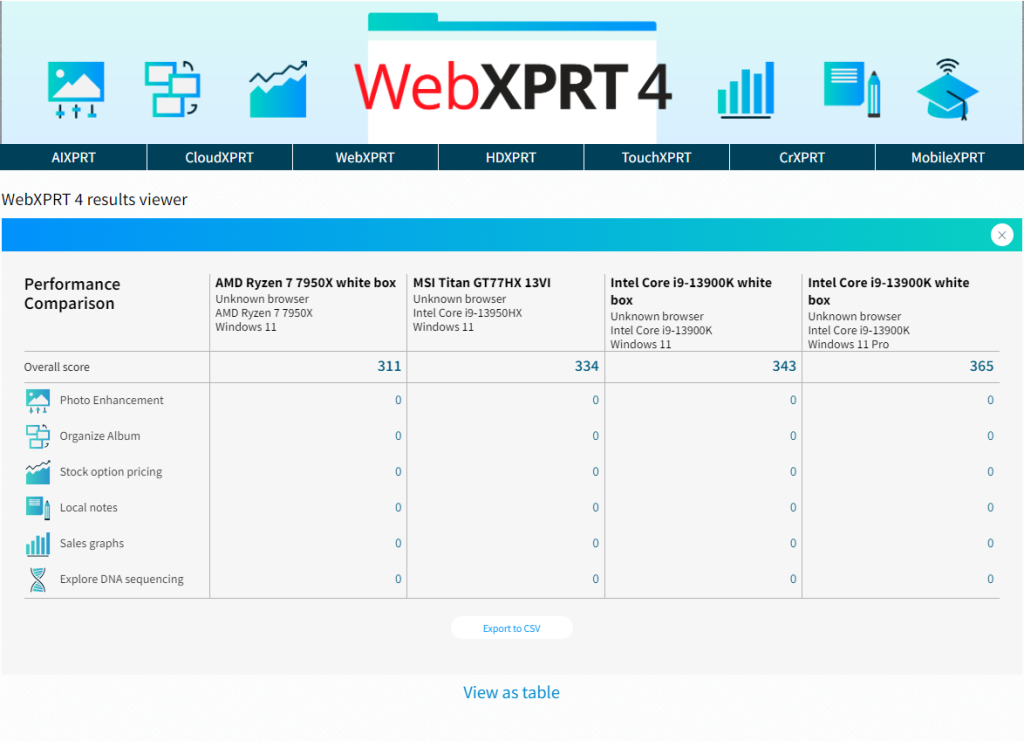
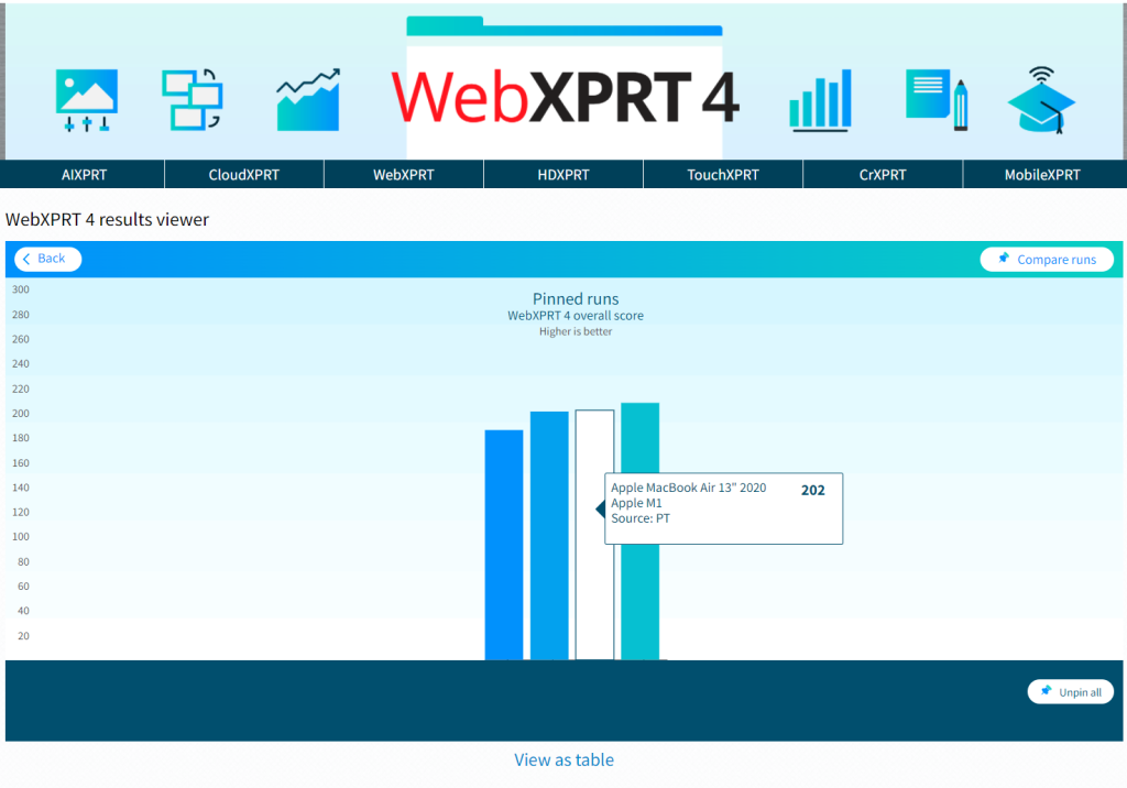
The viewer will also let you pin multiple specific runs, which is helpful for making side-by-side comparisons. Figure 4 shows the viewer after I pinned four runs and viewed them on the Pinned runs screen.
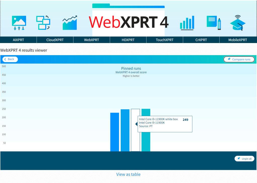
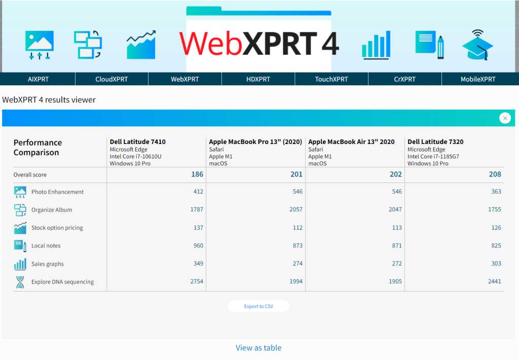
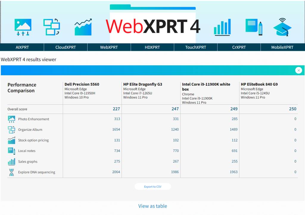
Figure 5 shows the viewer after I clicked the Compare runs button. The overall and individual workload scores of the pinned runs appear in a table.
We hope that you’ll enjoy using the results viewer to browse our WebXPRT 4 results database and that it will become one of your go-to resources for device comparison data.
Are there additional features you’d like to see in the viewer, or other ways we can improve it? Please let us know, and send us your latest test results!
Justin