
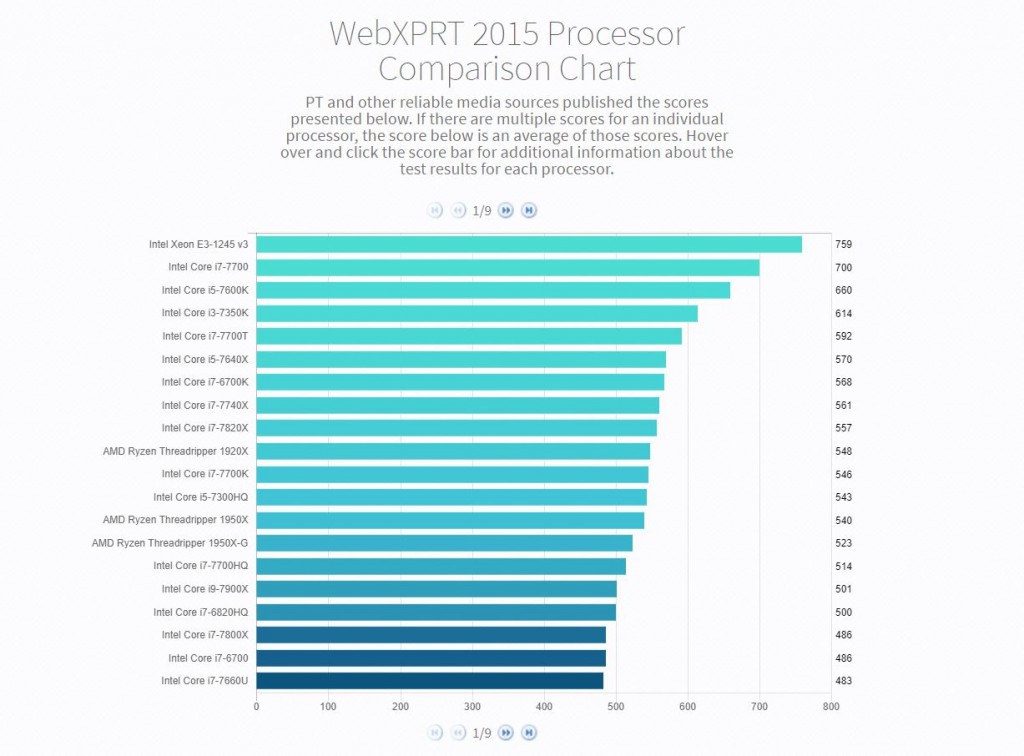
Today, we’re excited to announce the WebXPRT 2015 Processor Comparison Chart, a new tool that makes it easier to access hundreds of PT-curated, real-world performance scores from a wide range of devices covering everything from TVs to phones to tablets to PCs.
The chart offers a quick way to browse and compare WebXPRT 2015 results grouped by processor. Unlike benchmark-score charts that may contain results from unknown sources, PT hand-selected each of the results from internal lab testing and reliable tech media sources. If we published multiple scores for an individual processor, the score presented in the chart will be an average of those scores. Users can hover over and click individual score bars for additional information about the test results and test sources for each processor.
We think the WebXPRT Processor Comparison Chart will be a valuable resource for folks interested in performance testing and product evaluation, but the current iteration is only the beginning. We plan to add additional capabilities on a regular basis, such a detailed filtering and enhanced viewing and navigational options. It’s also possible that we may integrate other XPRT benchmarks down the road.
Most importantly, we want the chart to be a great asset for its users, and that’s where you come in. We’d love to hear your feedback on the features and types of data you’d like to see. If you have suggestions, please let us know!
Justin